


Back to List
Gallop MFR: Systematic Brand Upgrade
Date:2025.12.16
In 2026, Gallop MFR completed a full brand upgrade covering brand positioning, slogan, and visual identity system. With a business footprint spanning over 40 countries and regions, our client base has become increasingly international and professional, making the original brand image outdated.
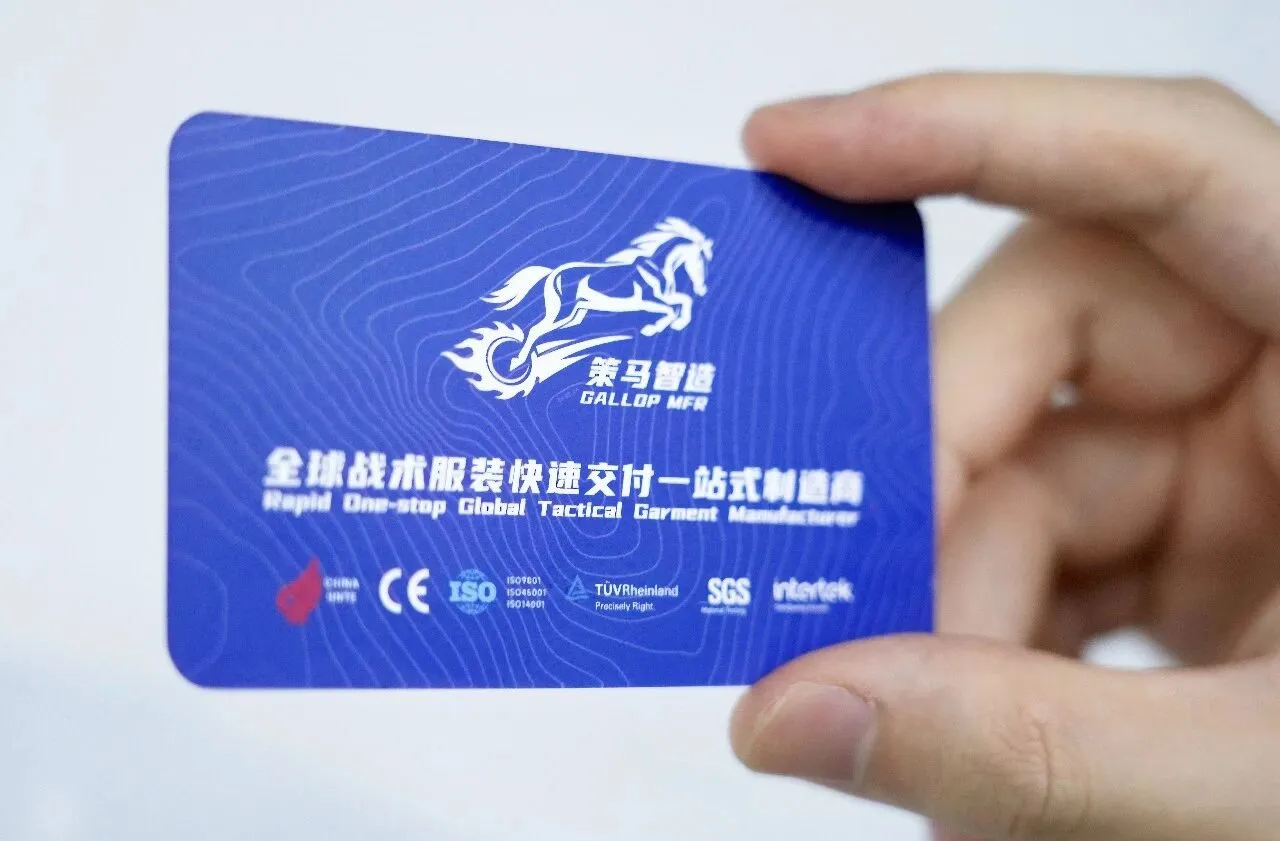
Core Positioning:
Gallop MFR’s most irreplaceable core value is fast delivery. Our goal is to convey the sense of "speed" to customers at first glance.
Three Core Elements of Visual Renewal:
Contour Line 8848.86
It represents our long-term goal of becoming a world-class military-industrial enterprise and the vision of ranking No.1 globally in our professional field. It symbolizes continuous progress, constant refinement, and self-breakthrough.
Brand Color Palette: Chinese Red & Navy Blue
Chinese Red: Rooted in Wuhan, serving professional clients in the industry
Navy Blue: Professionalism, reliability, customer first
Core Philosophy: Patriotism & Altruism, Customer First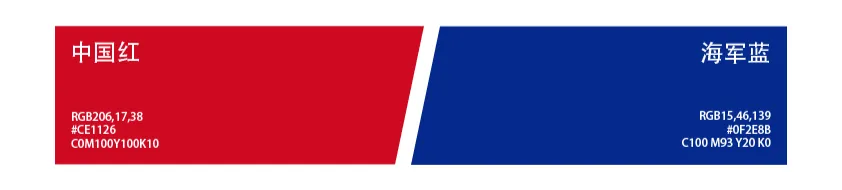
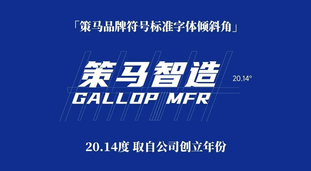
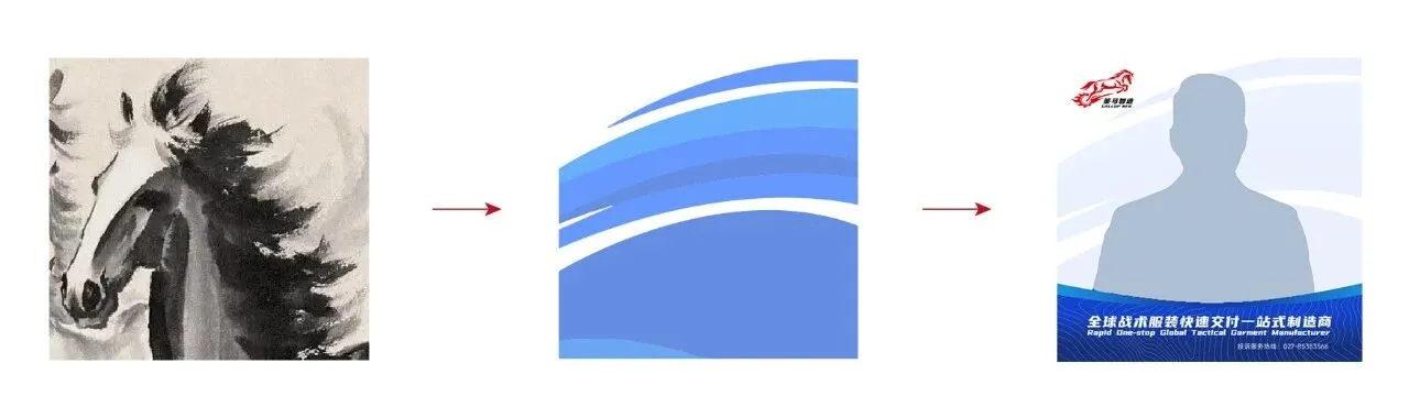
Flying Mane + 20.14° Inclination
The visual icon is a galloping steed stepping on wind-and-fire wheels, symbolizing speed.
English abbreviation: GALLOP MFR. Chinese short name: 策马智造 (Gallop MFR).
The abstract flying mane pattern serves as the avatar background, conveying a strong sense of speed.
The brand font is tilted at 20.14°, a tribute to the company’s founding year 2014.
Conclusion:
Our brand upgrade is to live up to every trust entrusted to us.
Slogan: Larger, Faster, Orders On Time.
Positioning: The Leader of Rapid Delivery in Tactical Garment.

Subscribe to our newsletter

Follow us




Contact:+86 15827407494

contact
CopyRight ©️ 2025 Hubei gallop Garment Industry Co.. Ltd. All rights reserved.
川公网安备51019002002118号 蜀ICP备2024058509号-1